
STORY NAME
Alchemy with Ambi
FILED UNDER
Brand, Website, Collateral
PLOT WORDS
Ethereal, Refined, Magnetic
SUMMARY
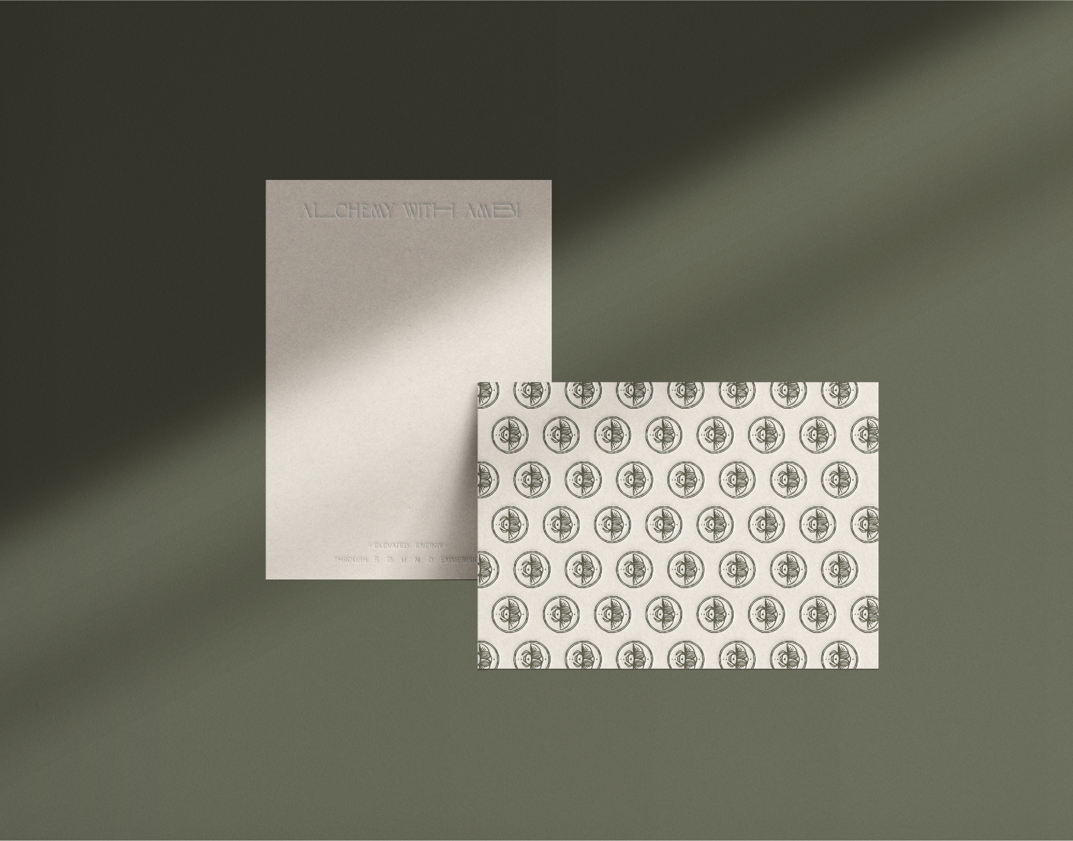
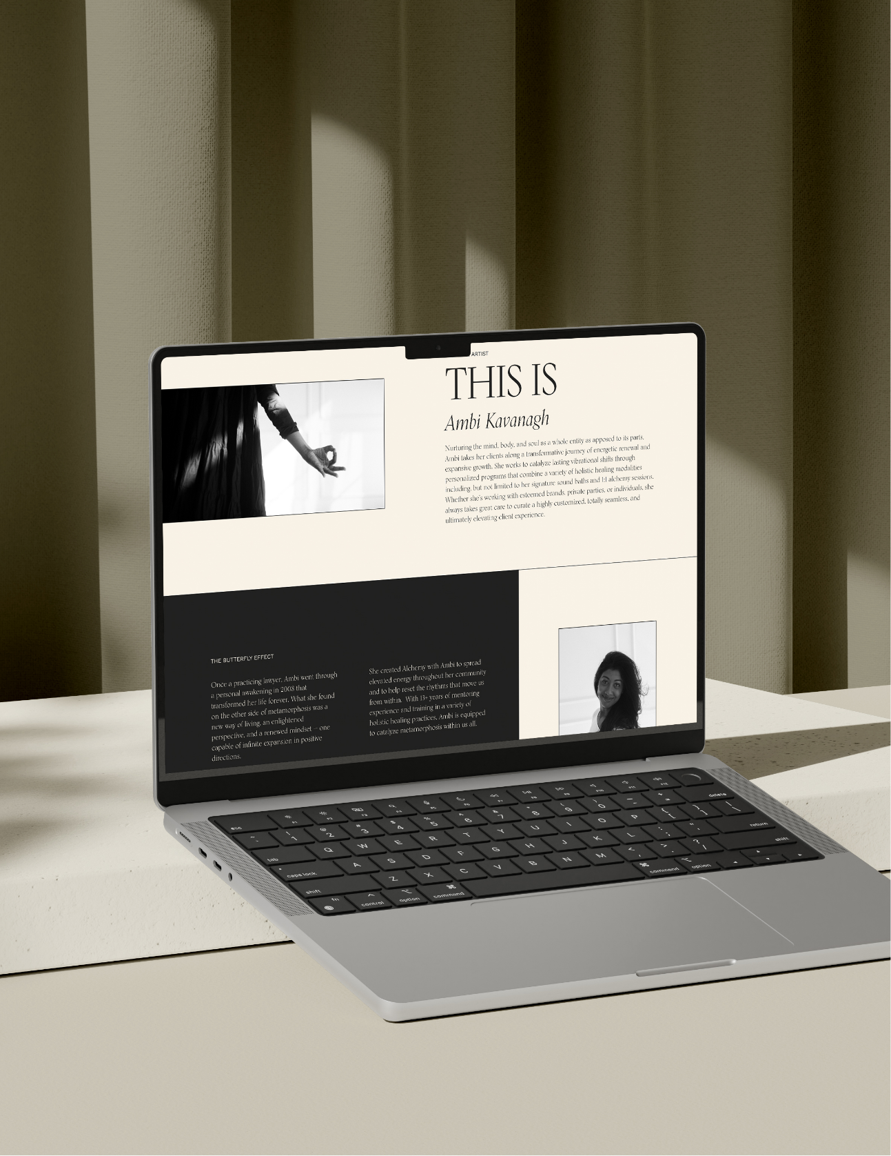
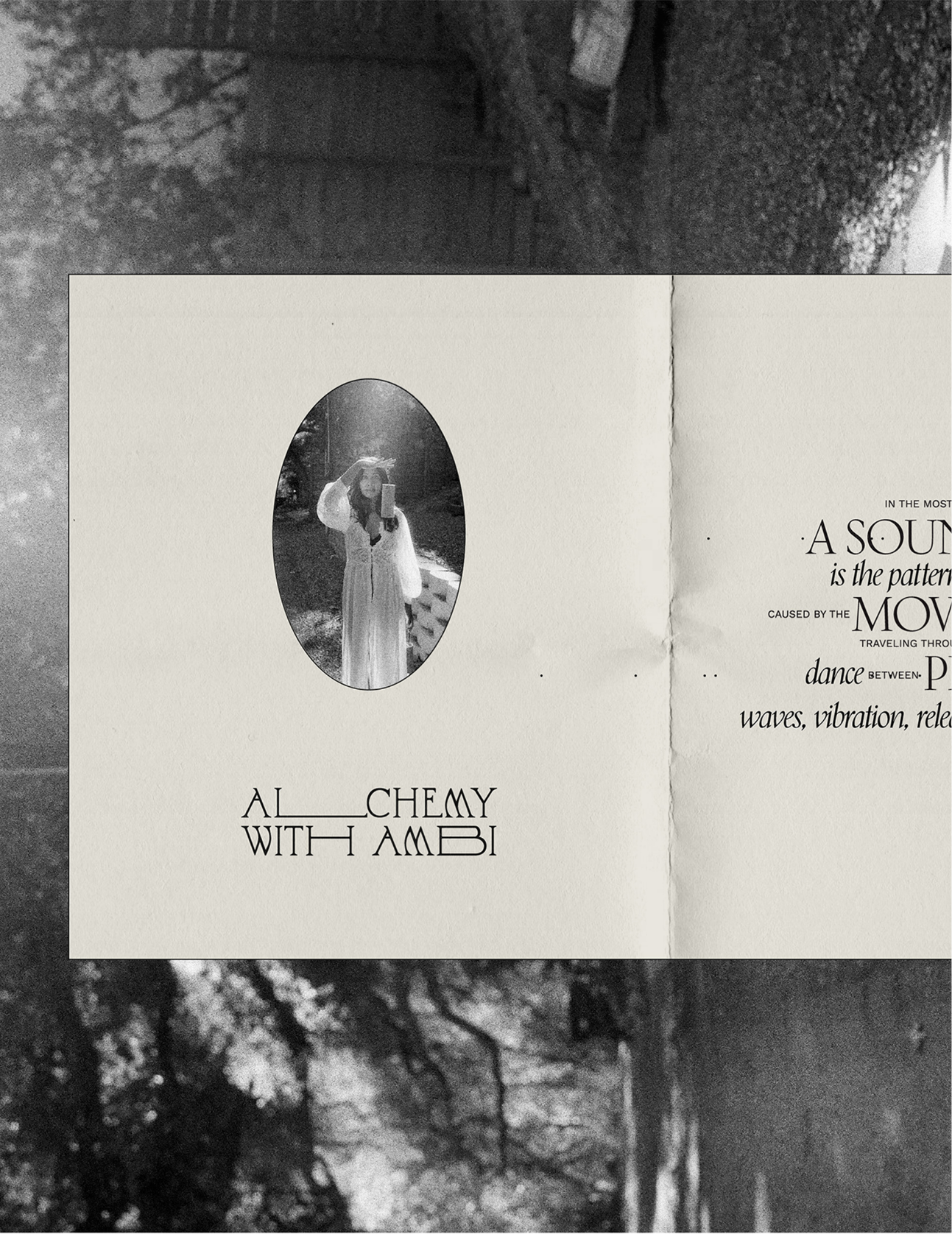
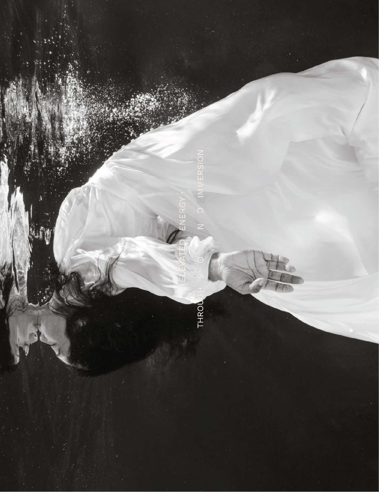
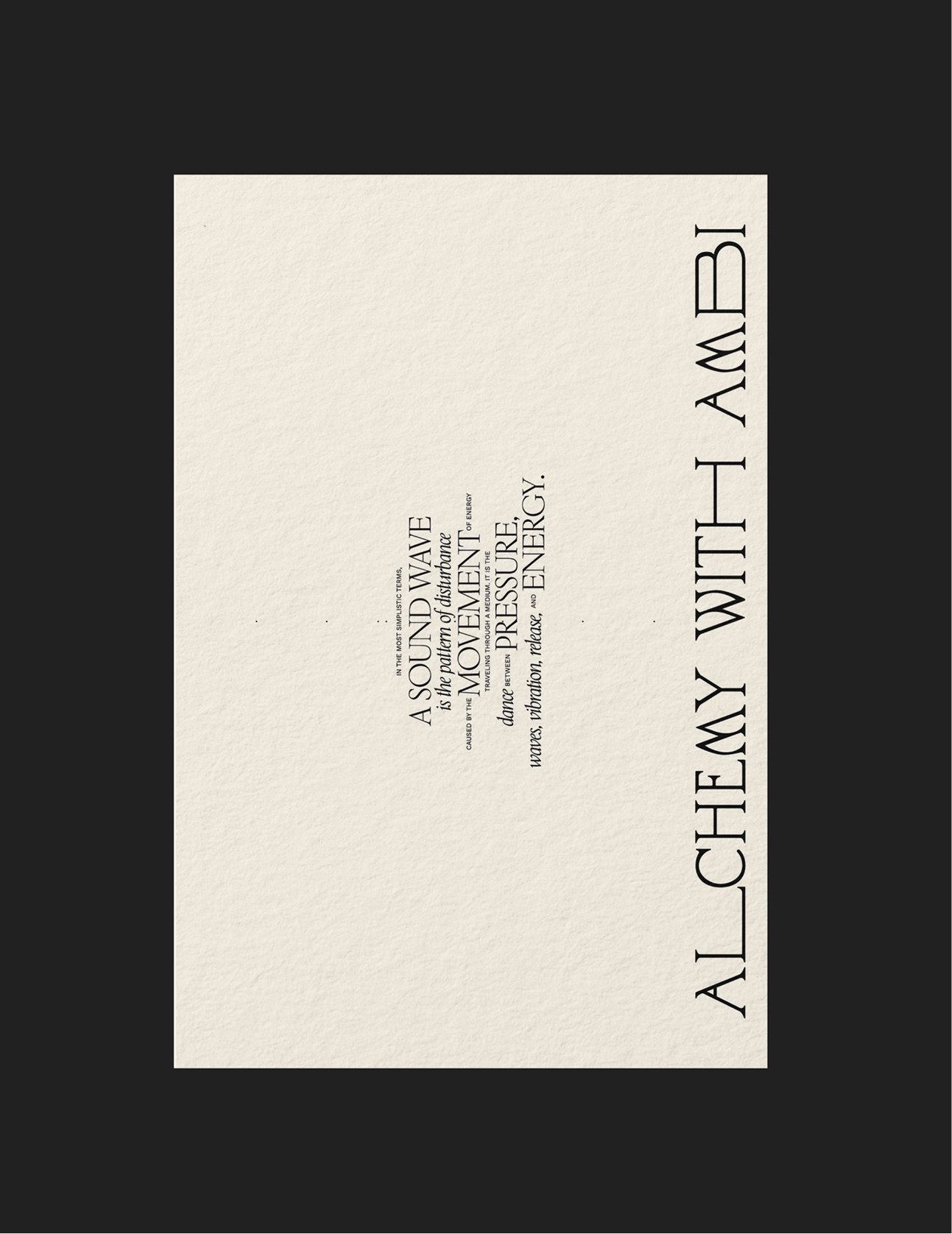
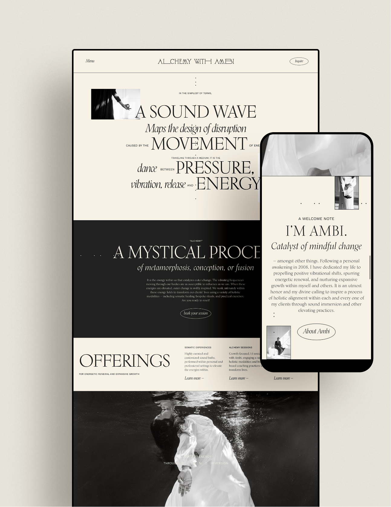
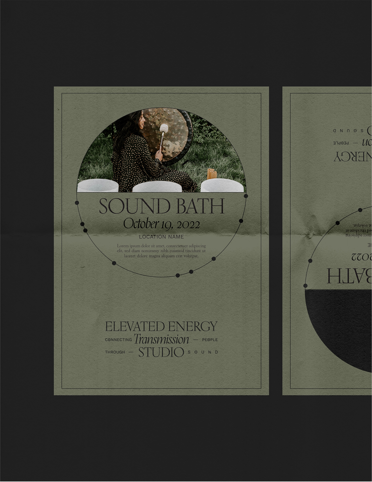
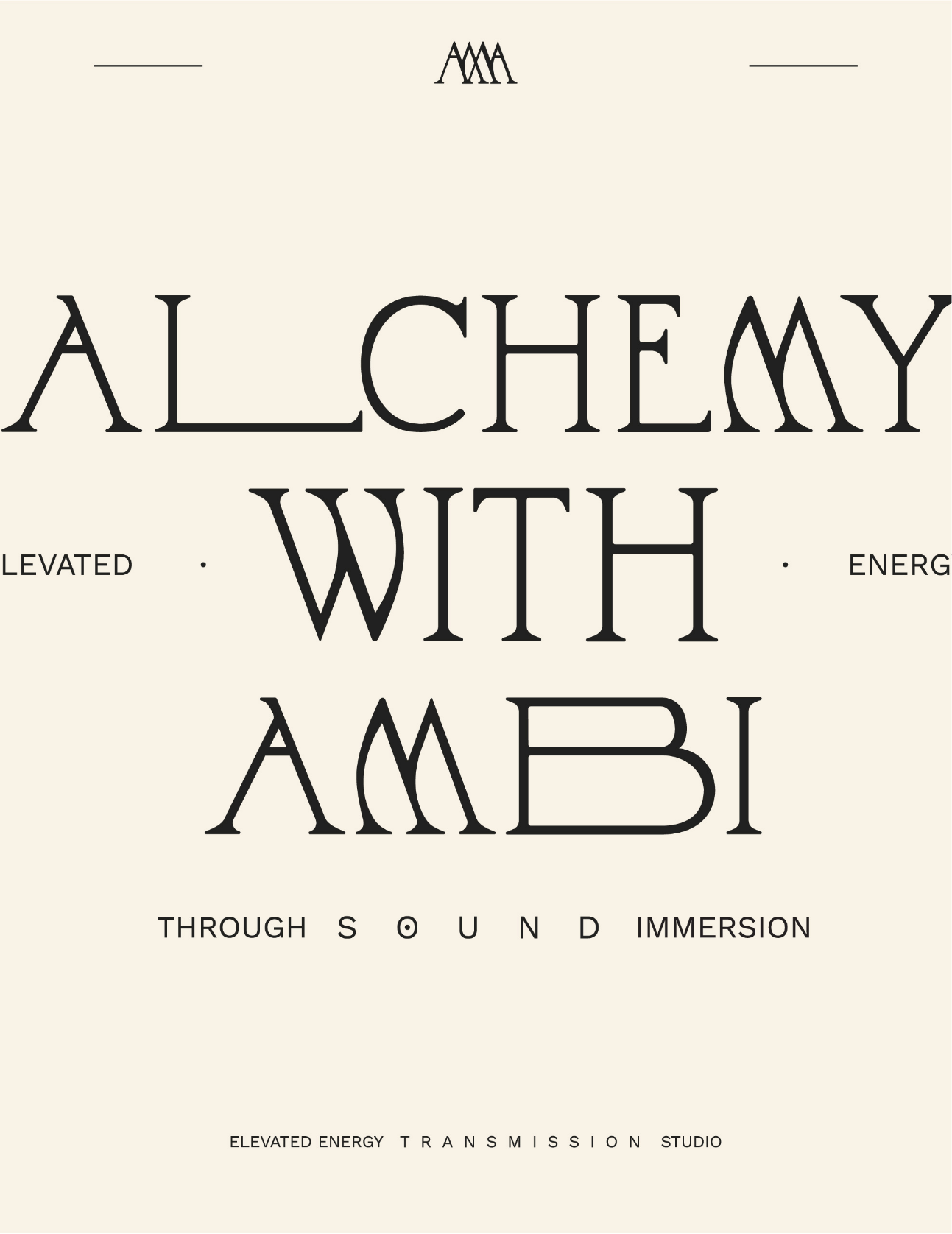
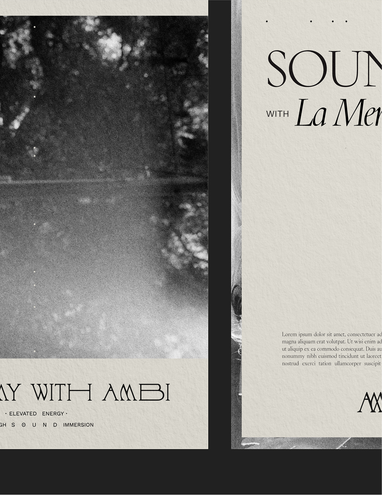
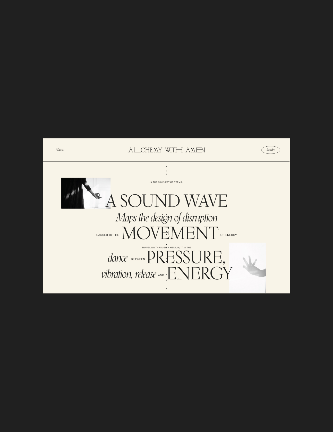
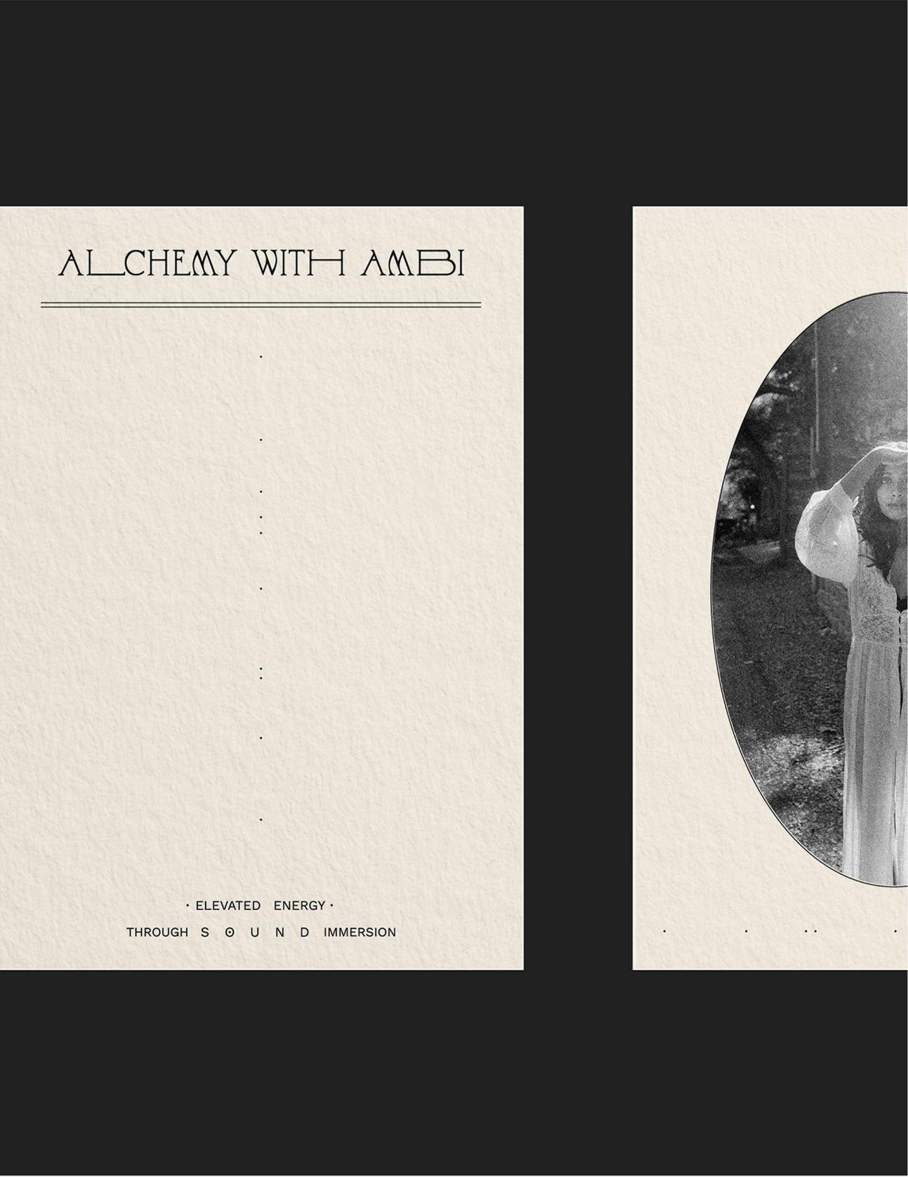
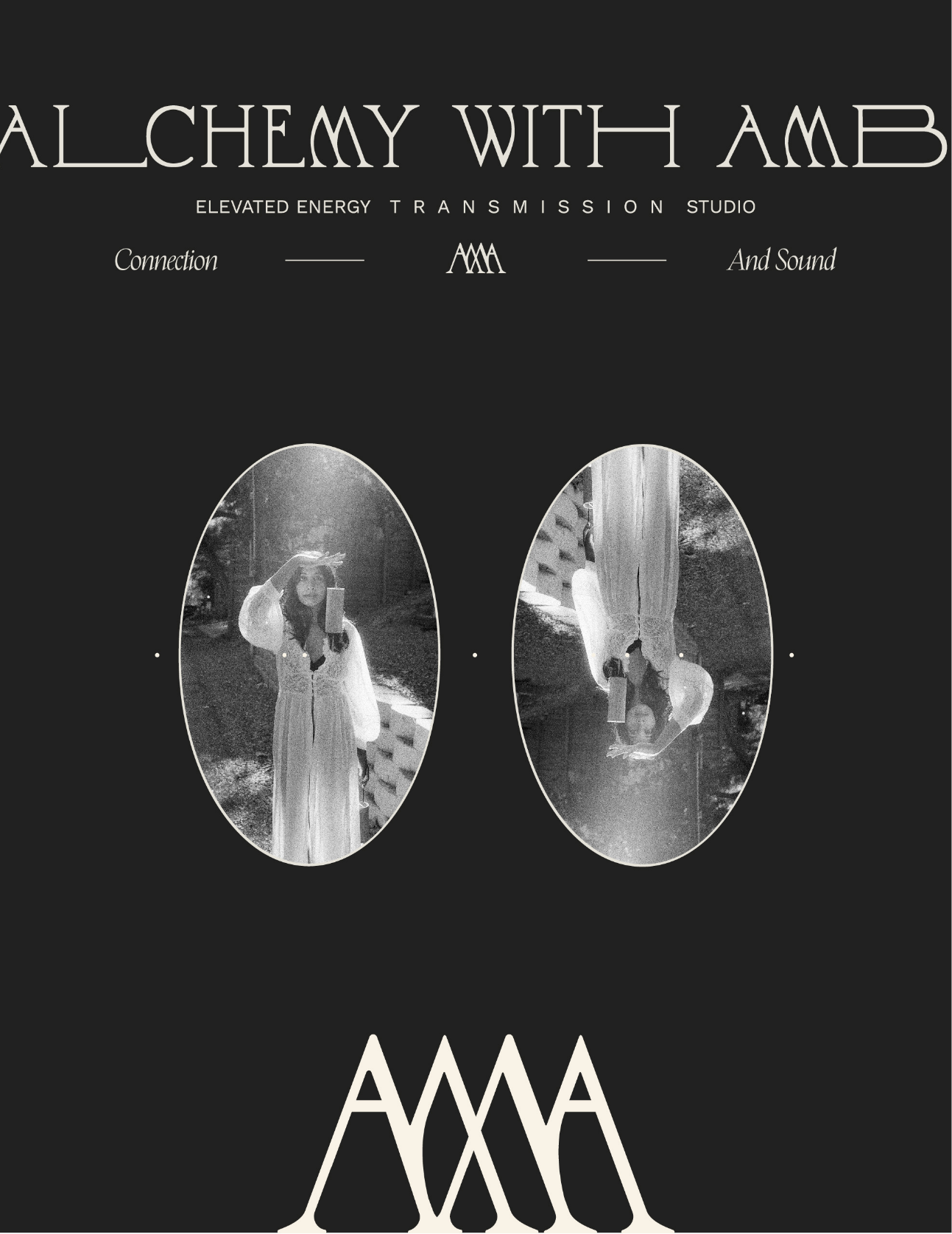
Alchemy with Ambi is the product of luxury and spiritual energy woven artistically together. In order to represent this in the branding, we utilized an editorial and sophisticated composition structure (to represent the chic and refined experience), artistic and artistically enriched typography (to embody the high quality and mystical aspect), geographic accents with grid/break from grid moments (to symbolize both the transitioning and shifting of energy and the distruption of pattern), and organic/textured touches (to embody the grounding and earthy quality of the brand).
LOVE NOTE
“Kaitlin, I am absolutely blown away, in the best possible way. I am so glad I found you and chose to invest in you. I know it is a decision that is going to both reap rewards for my business and satiate my soul in the best possible way.
I am truly enamored with what you’ve done and with all the intention behind it. So very impressed with your process and the consciousness behind what you create. It is a rare and special talent that you have and I am so grateful to be working with you!”


FOOTNOTES
Behind The Design
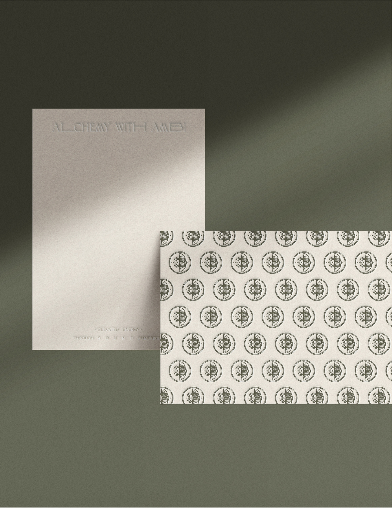
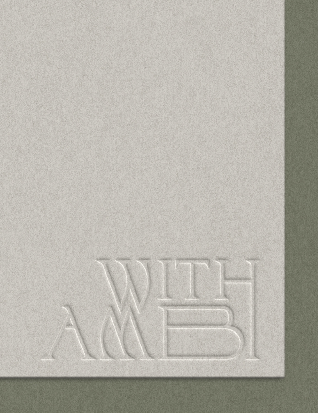
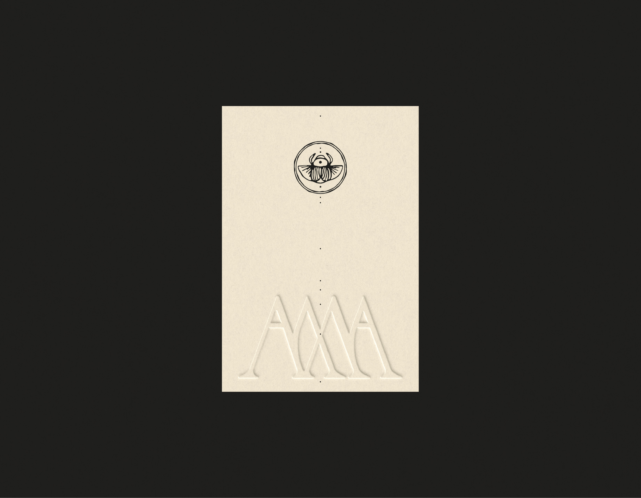
Alchemy with Ambi’s primary logo establishes the artistic, sophisticated, and ethereal typography used throughout the brand identity. The clean and geometric aspects of the type dance with the more fluid and bending ones to fully embrace the different shiftings and shapings of energy in the brand’s sessions. The type is hand-crafted to embody different symbolizations - various letters are elongated (L, H, and B) to represent the journey and growth clients feel within their experiences. They are essentially being led from one place to another, mindfully and spiritually, and are experiencing a deep connection to both Ambi and themselves while doing so. The Ms and W are crafted in a curved, mirrored manner to represent the concept of sound waves and their fluid motion from one object or person to another. It provides a sense of movement along with the elongated letters to really embody the idea that the energy in the space is constantly growing, shifting, curving, disrupting, and transmitting.
Lastly, a few letters are used for each customization, rather than one, to symbolize the idea of patterns and the transformation of them. Essentially, turning objects, sound waves, and energy into art.


FOOTNOTES
Inspired By
scarabs, elegant type, luxury spas, concrete poetry, editorial magazines, moring meditations, green and carrot juices