
STORY NAME
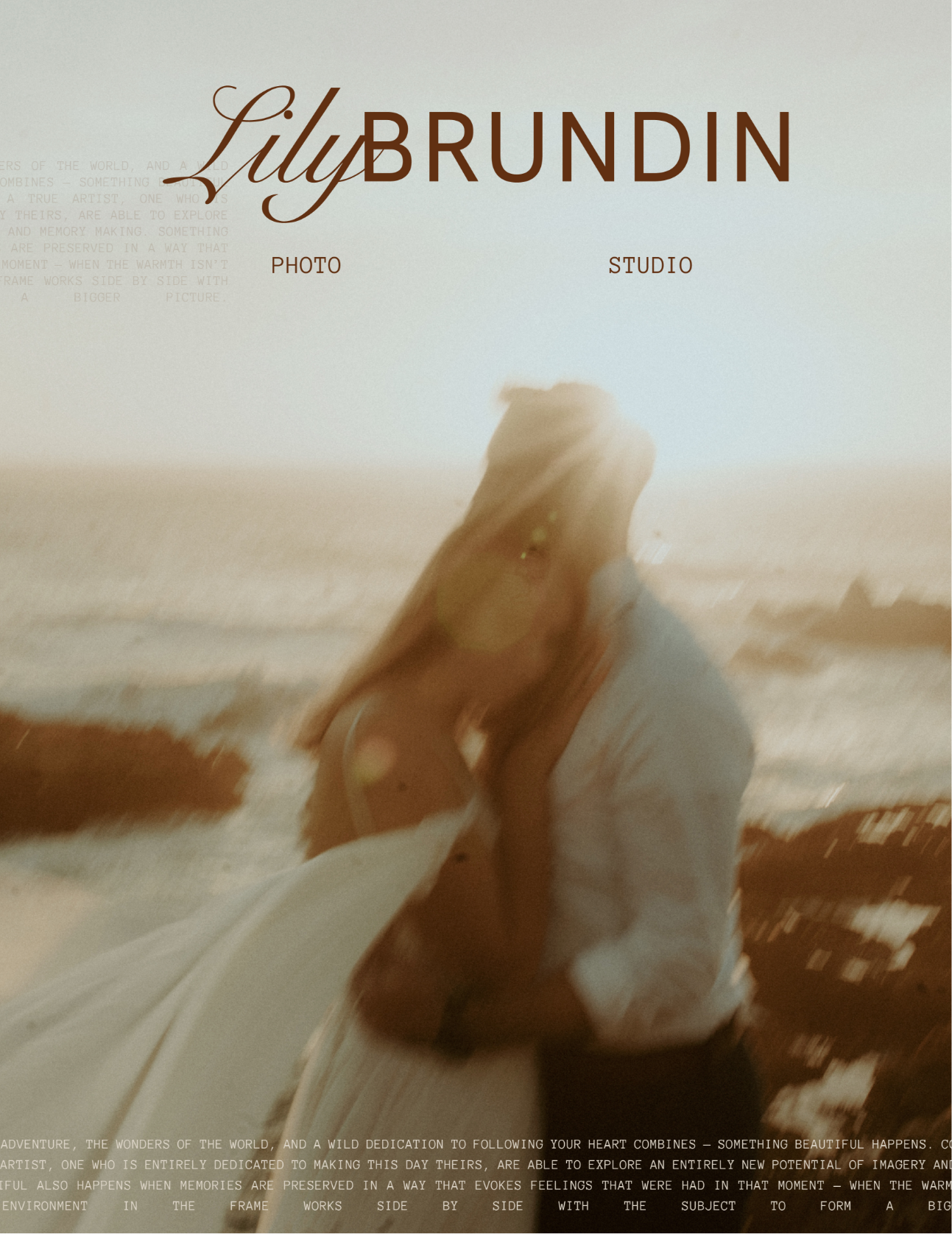
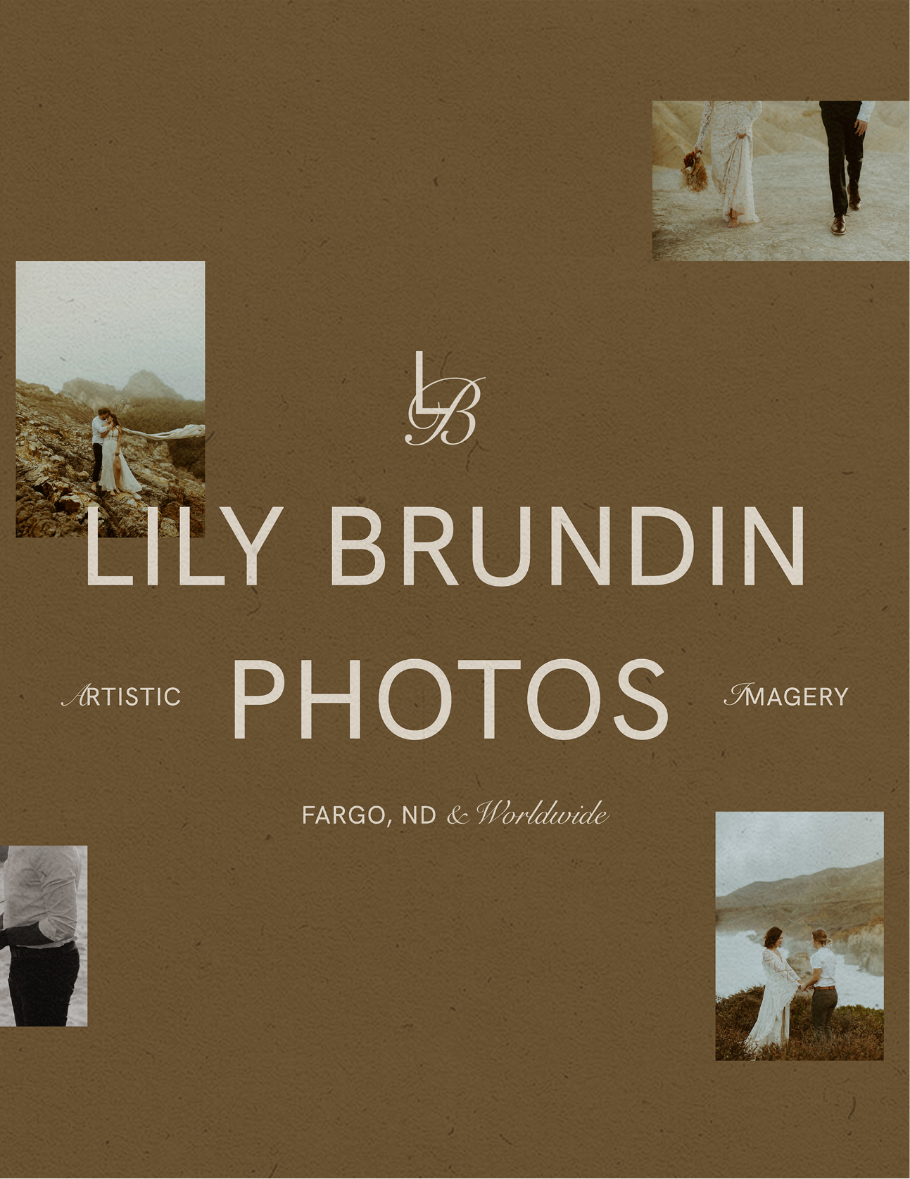
Lily Brundin Photos
FILED UNDER
Brand, Website
PLOT WORDS
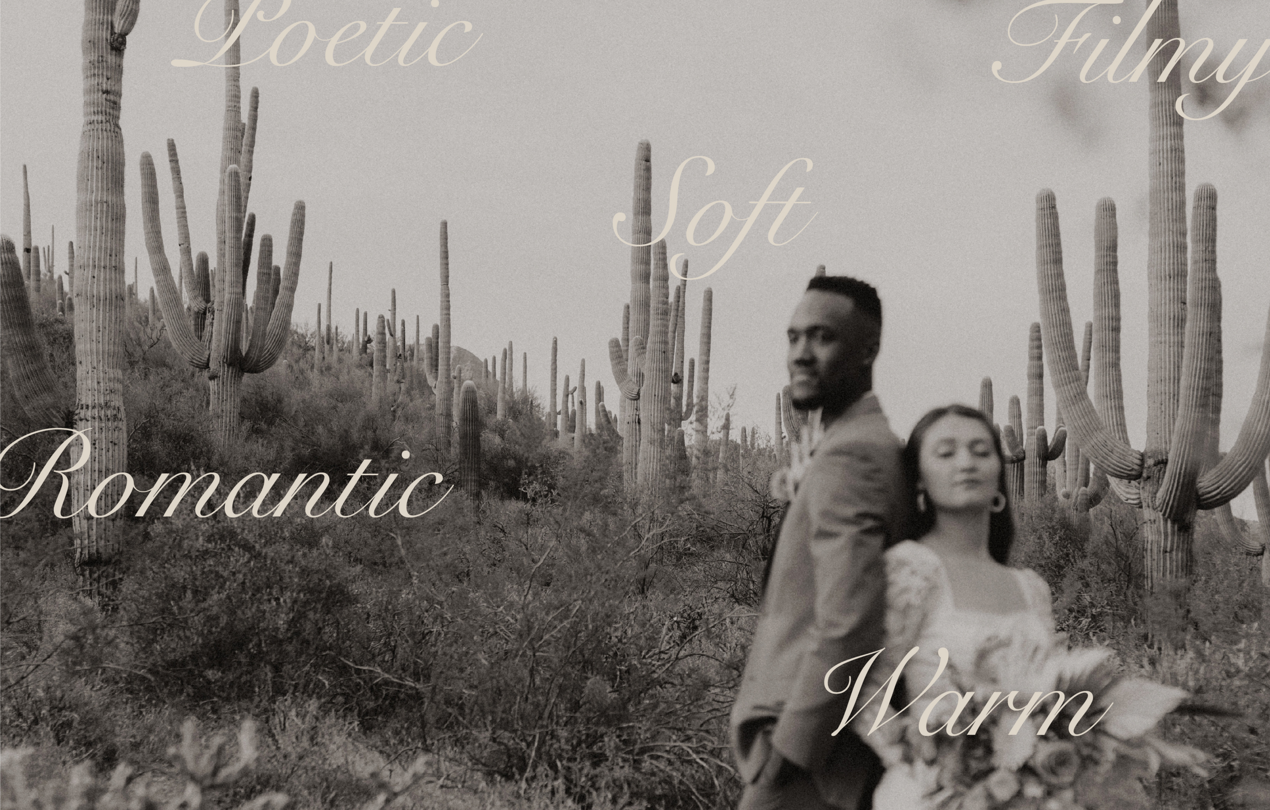
Romantic, Cinematic, Lyrical, Organic
SUMMARY
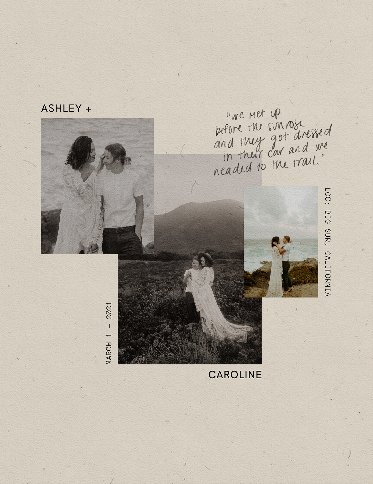
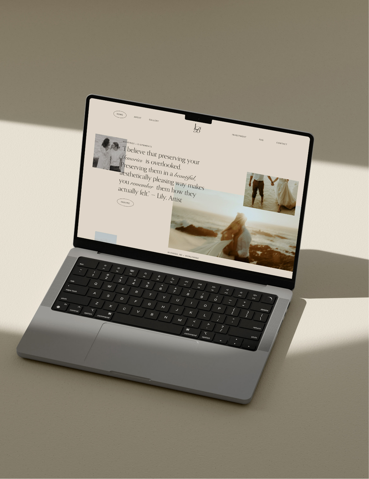
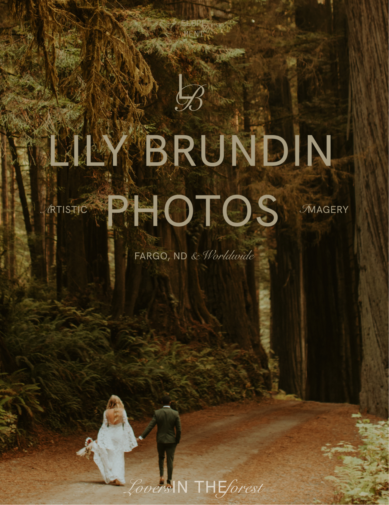
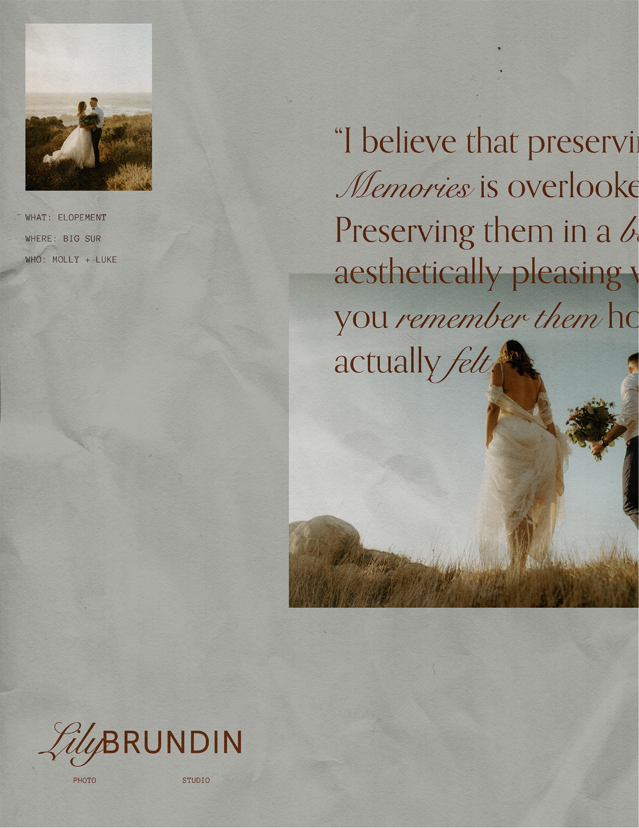
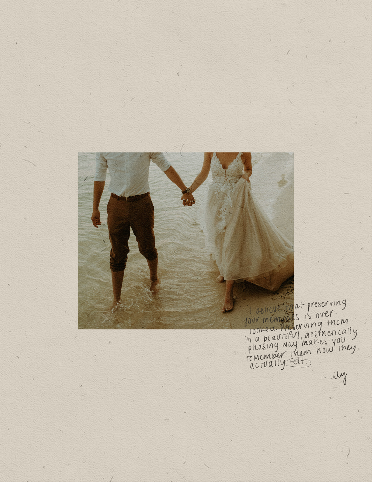
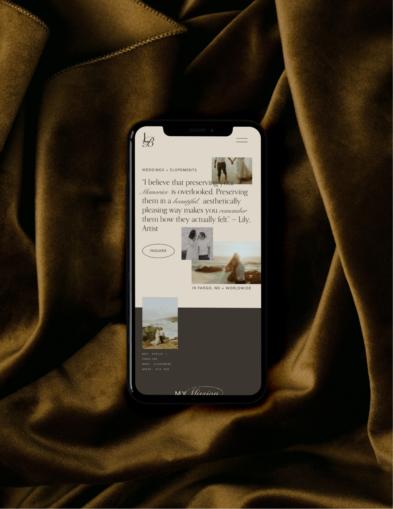
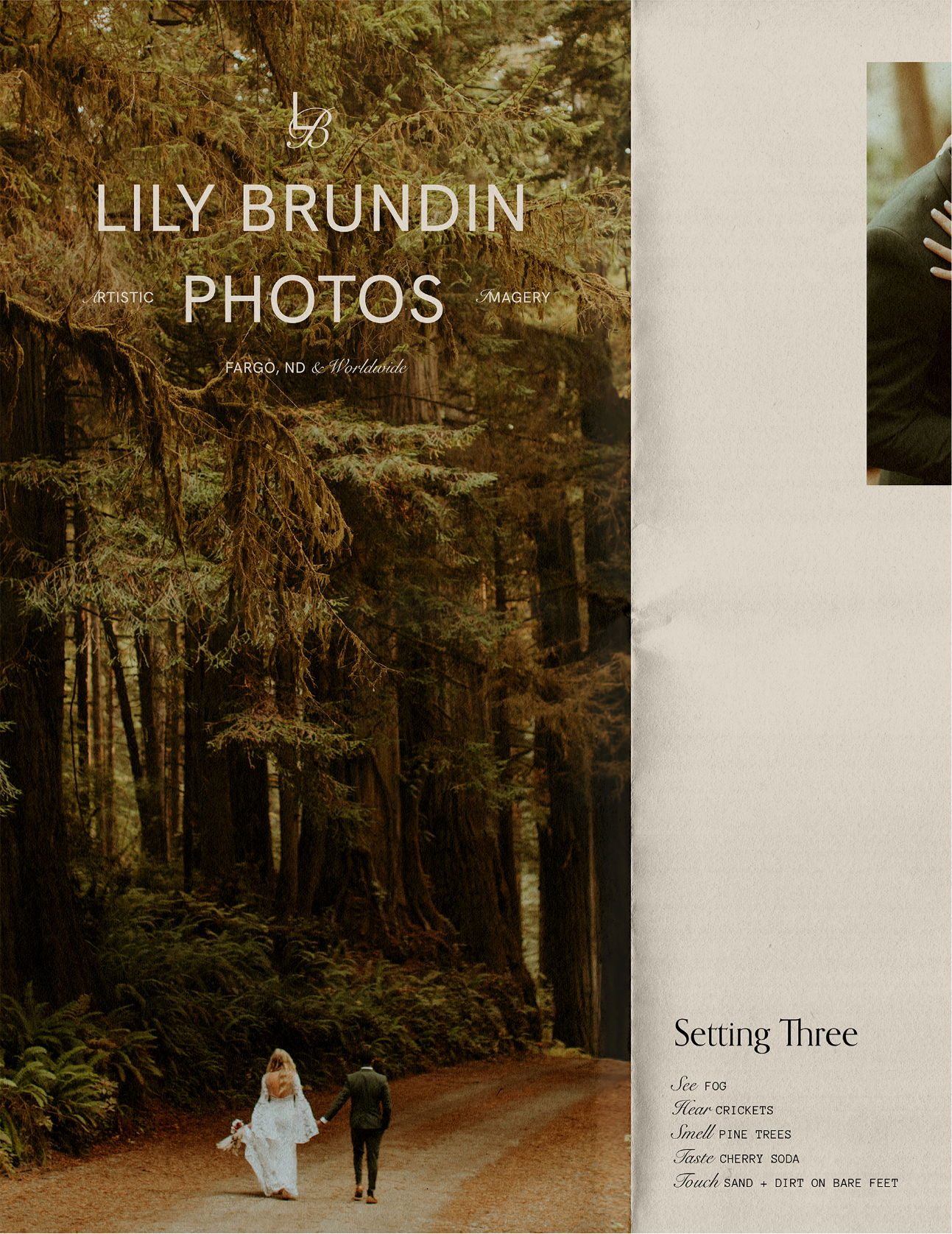
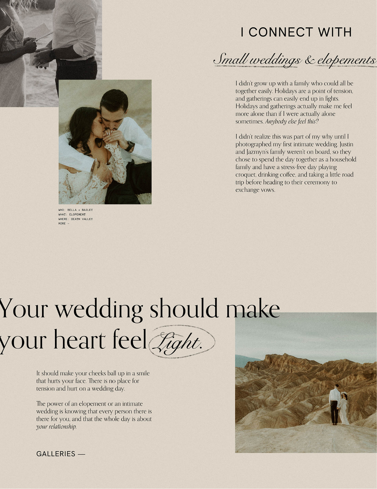
Lily Brundin Photos romanticizes the little moments. It’s the feeling of making it to the top and feeling so full of life without having fully opened your eyes yet. It embodies poetic, subtle, and cinematic-like tones of its imagery through minimal and old-school type with hand-done romantic accents. It embodies adventurous and travel-inspired motifs through a journal-like layout. It utilizes a laidback and “come as you are” aesthetic through intentionally messy and imperfect compositions. And lastly, it represents the idea of art through a scapbook inspired feel combining design with imagery to create a full-hearted and big-picture experience.
LOVE NOTE
“WOW WOW WOW YAY. I'm so in love and excited about this.
Aesthetics aside, you are so THOROUGH. It made me feel like every decision we made was the right one.”


FOOTNOTES
Behind The Design
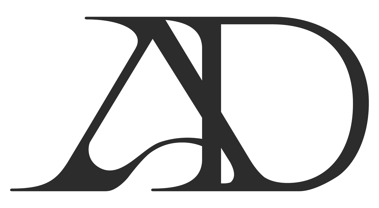
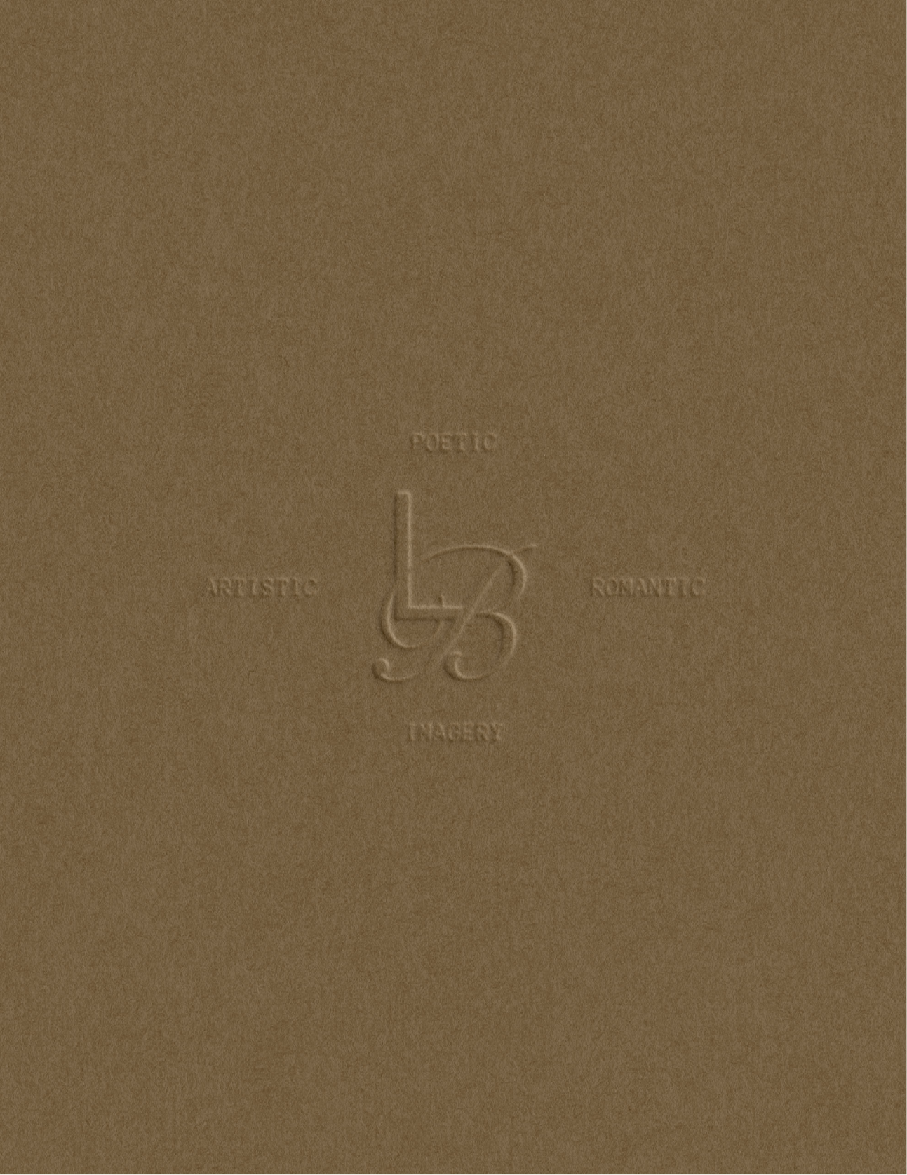
The mixture of minimal and romantic fonts is the main focus of the brand identity — used to embody the idea of “romanticizing the simple moments”, with the minimal sans serif font representing the day to day things and the vintage script representing the touches of beautification and romanticization. Lily Brundin’s dream clients are laid back, lighthearted, down to earth, and madly in love (both with each other, themselves, and life), so the primary minimal sans serif font was chosen to represent this grounded relatability.
The classic and vintage script also resembles this nostalgic feeling. It is used paringly either as the first letter of a word or to put emphasis on a certain part of the sentence — once again representing this simple idea of finding sparks of beauty in the littlest things or moments.


FOOTNOTES
Inspired By
film cameras, old movie posters, travel journals, and lots of romance


