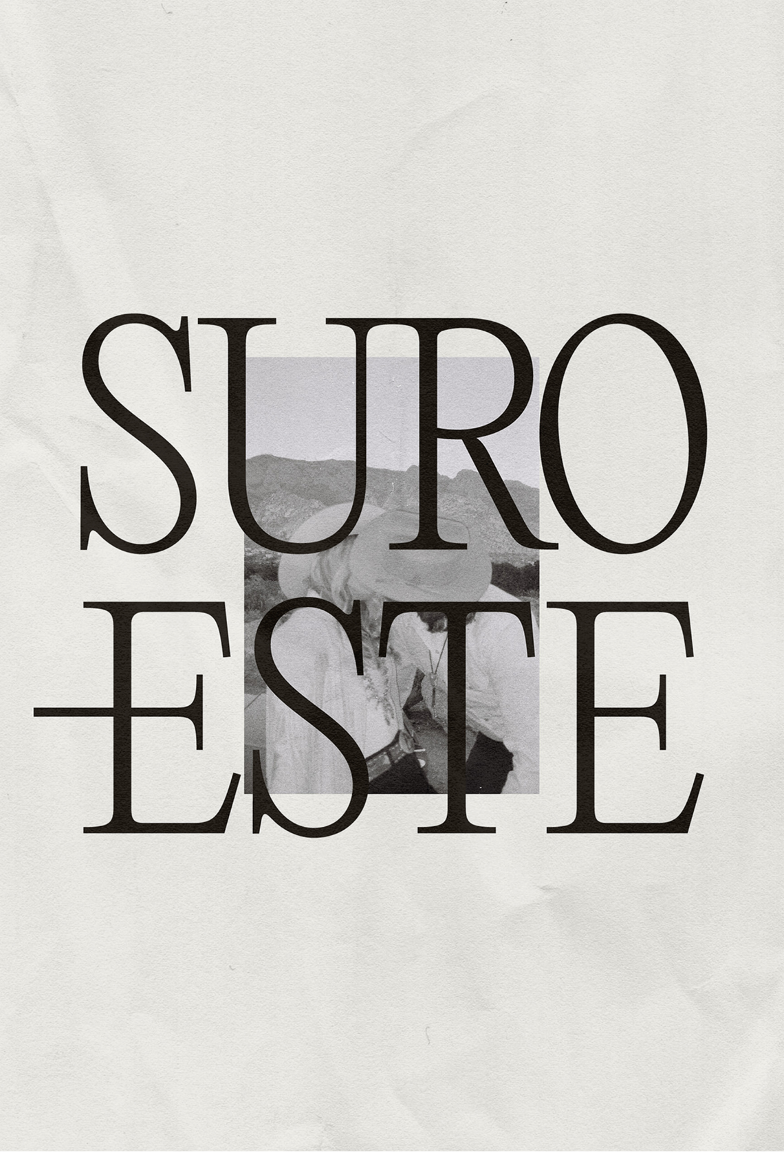
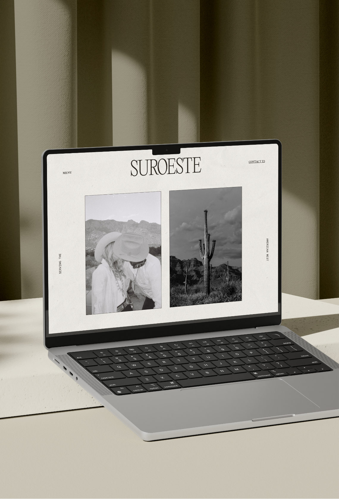
STORY NAME
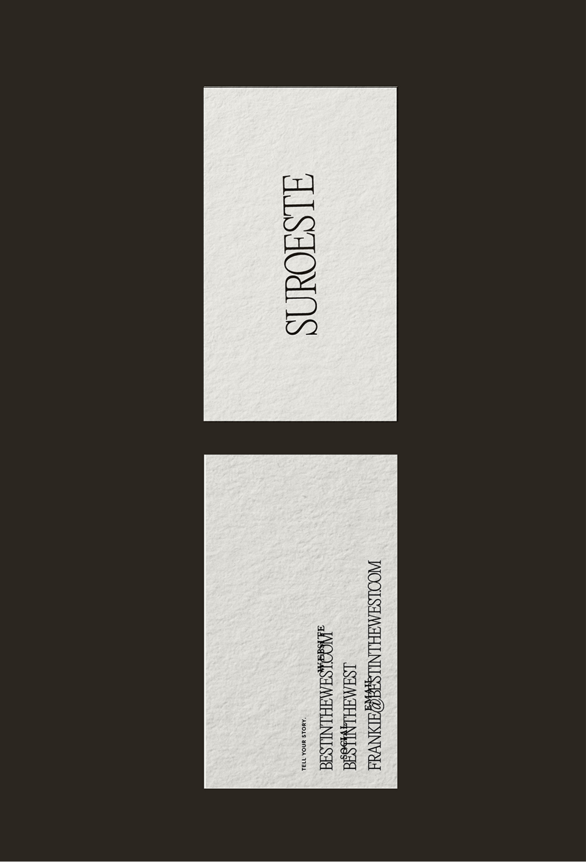
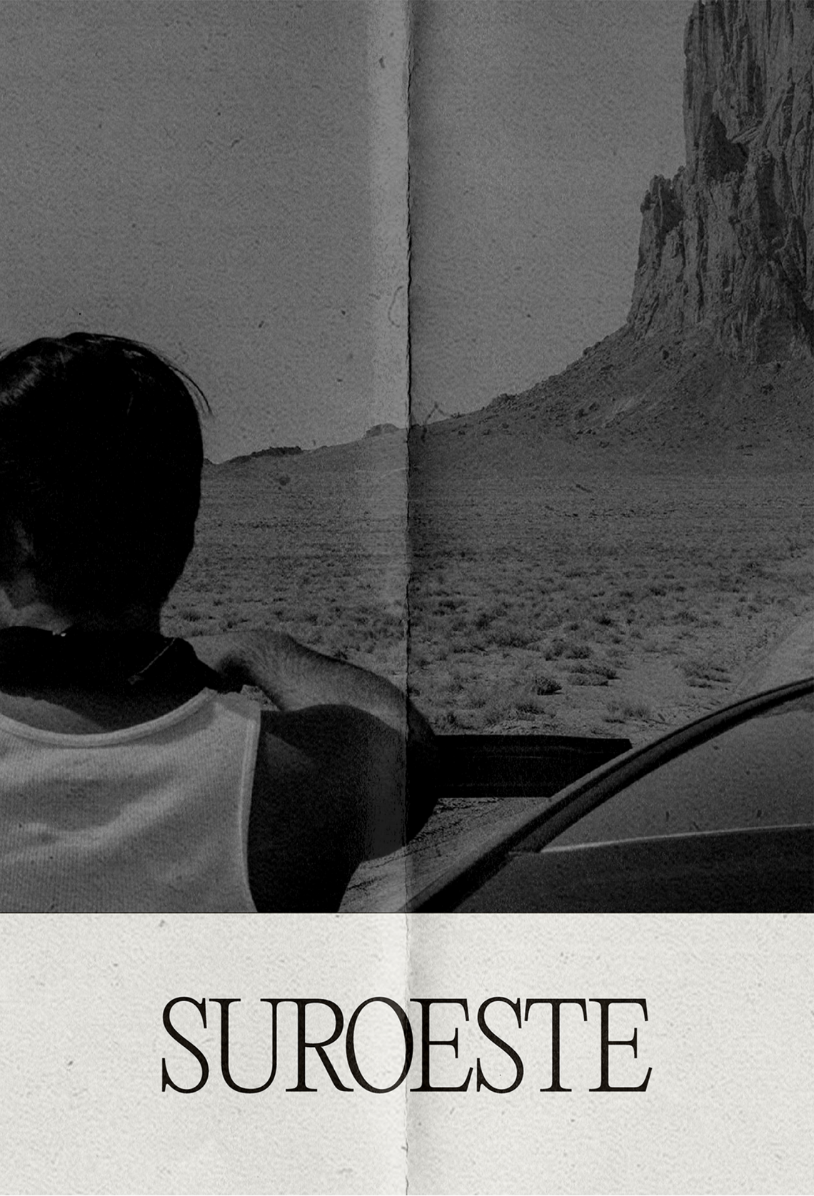
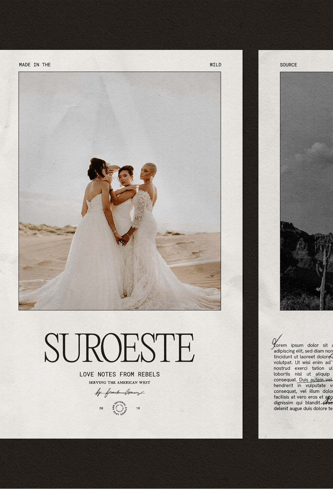
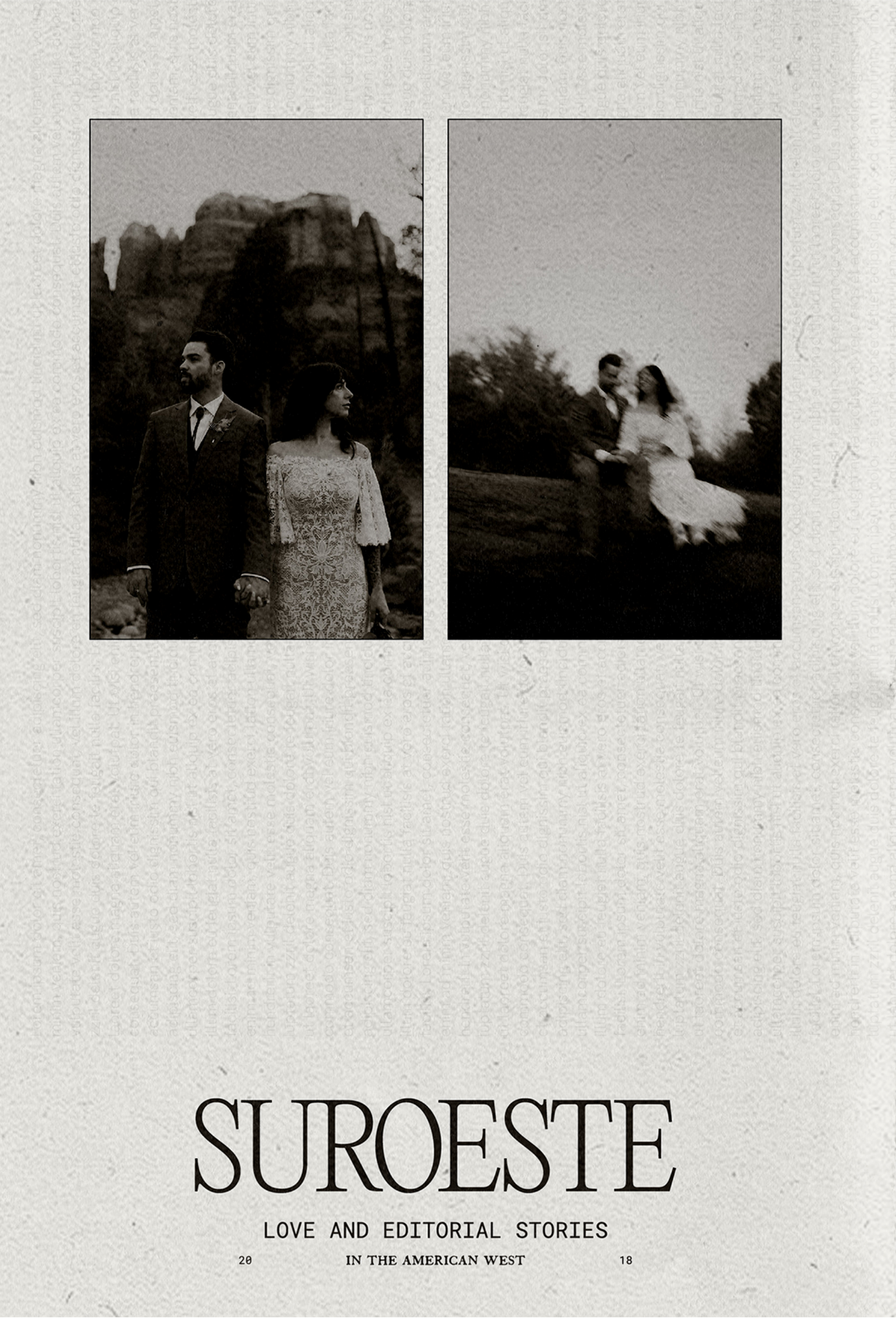
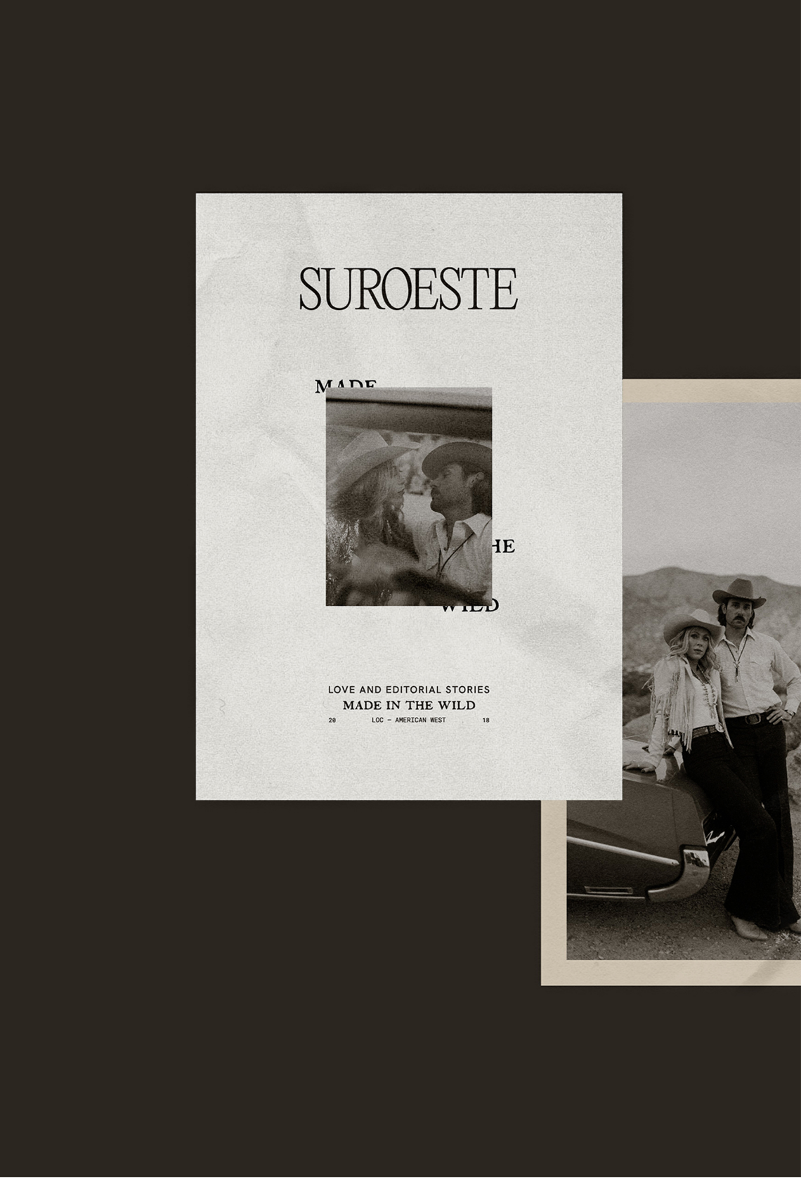
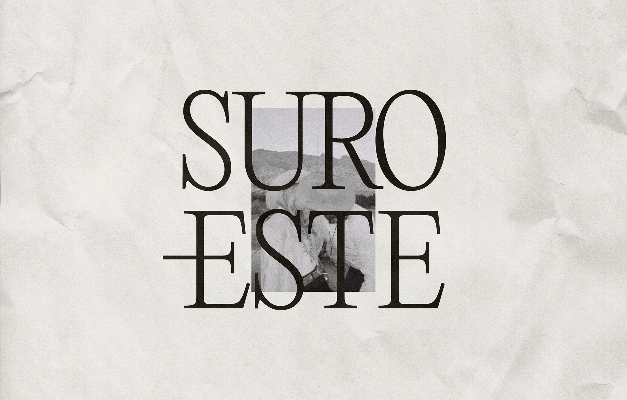
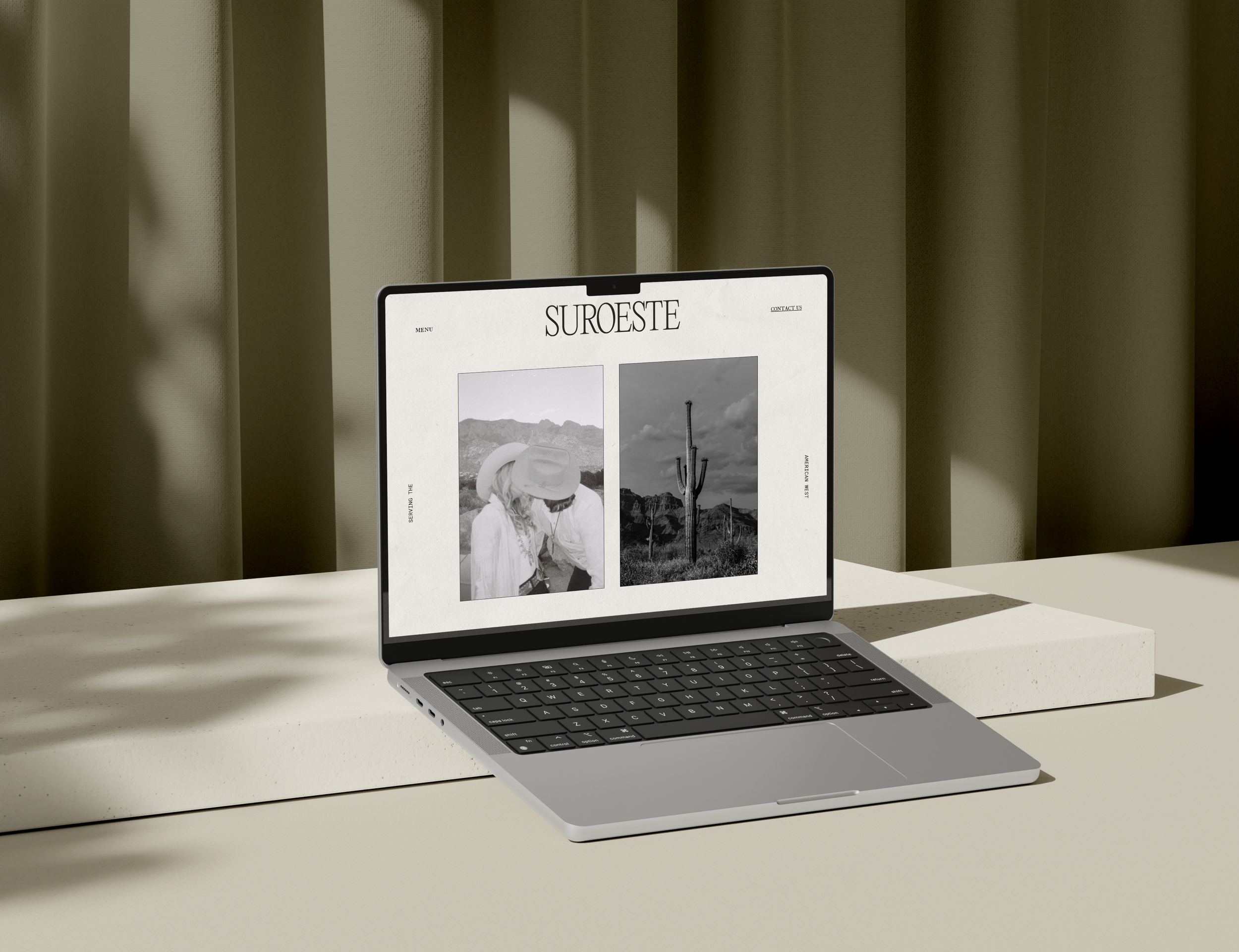
Suroeste
FILED UNDER
Brand, Website, Collateral
PLOT WORDS
Rebellious, Editorial, Sensual, Vintage
SUMMARY
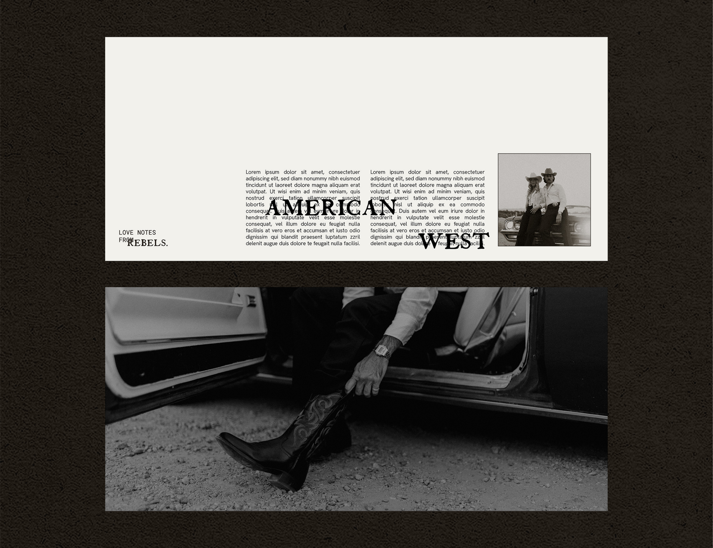
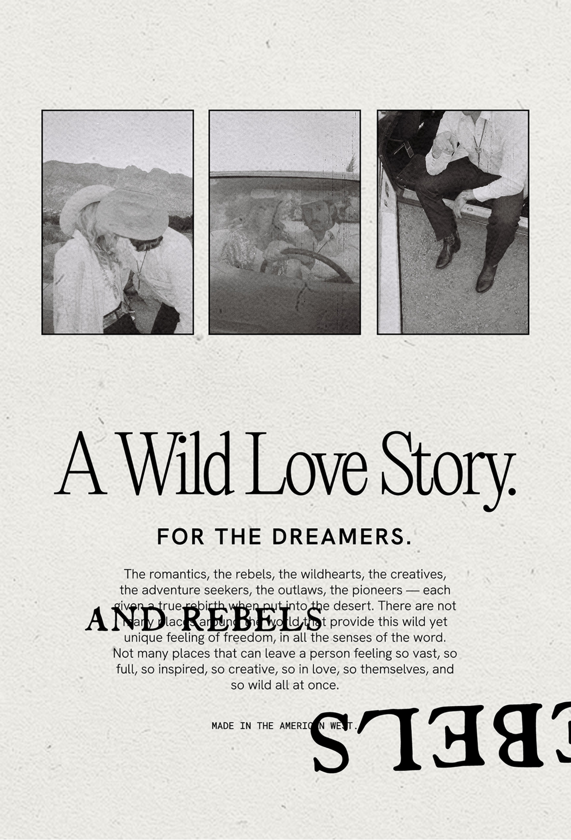
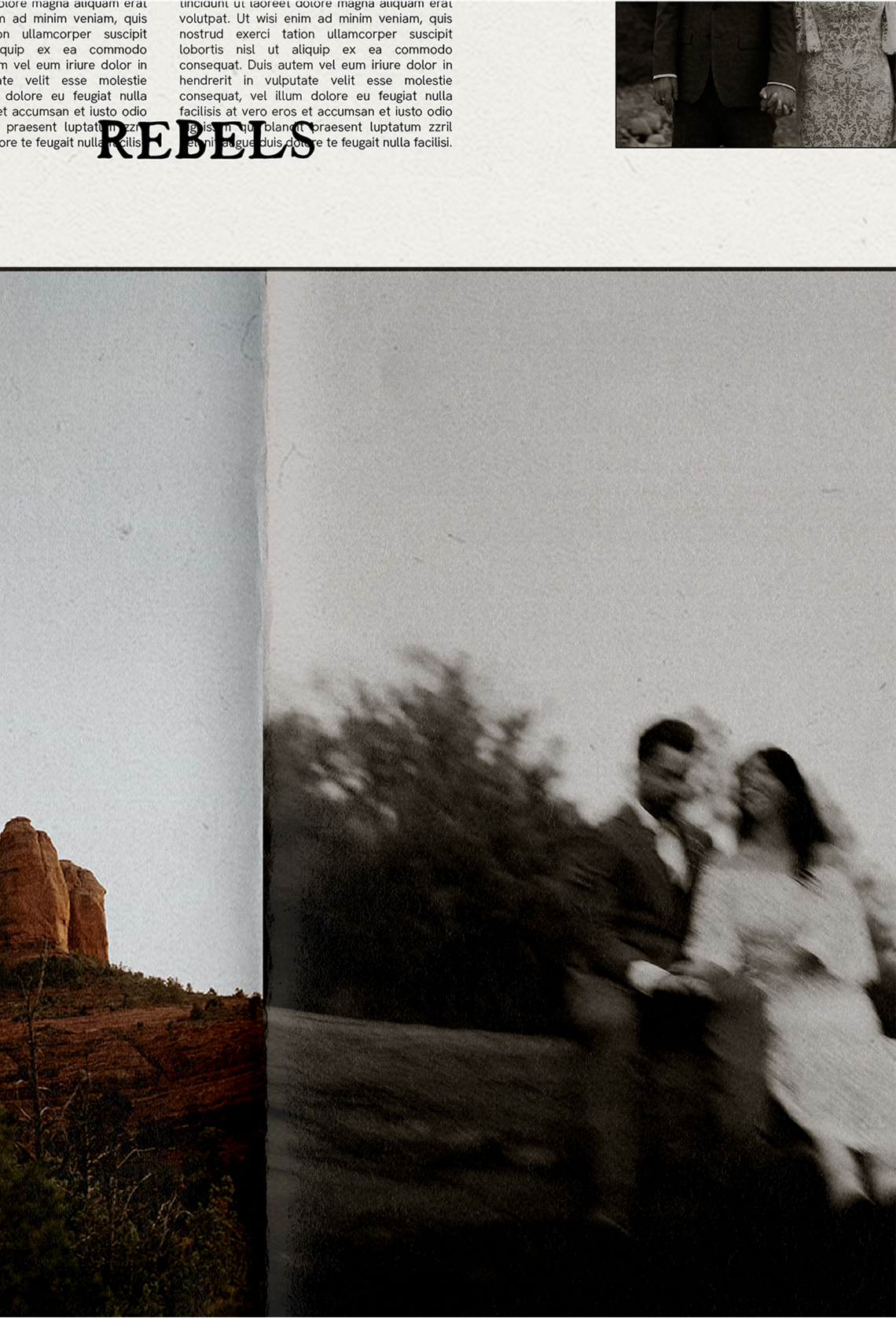
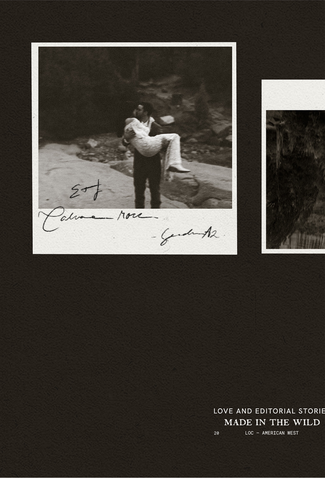
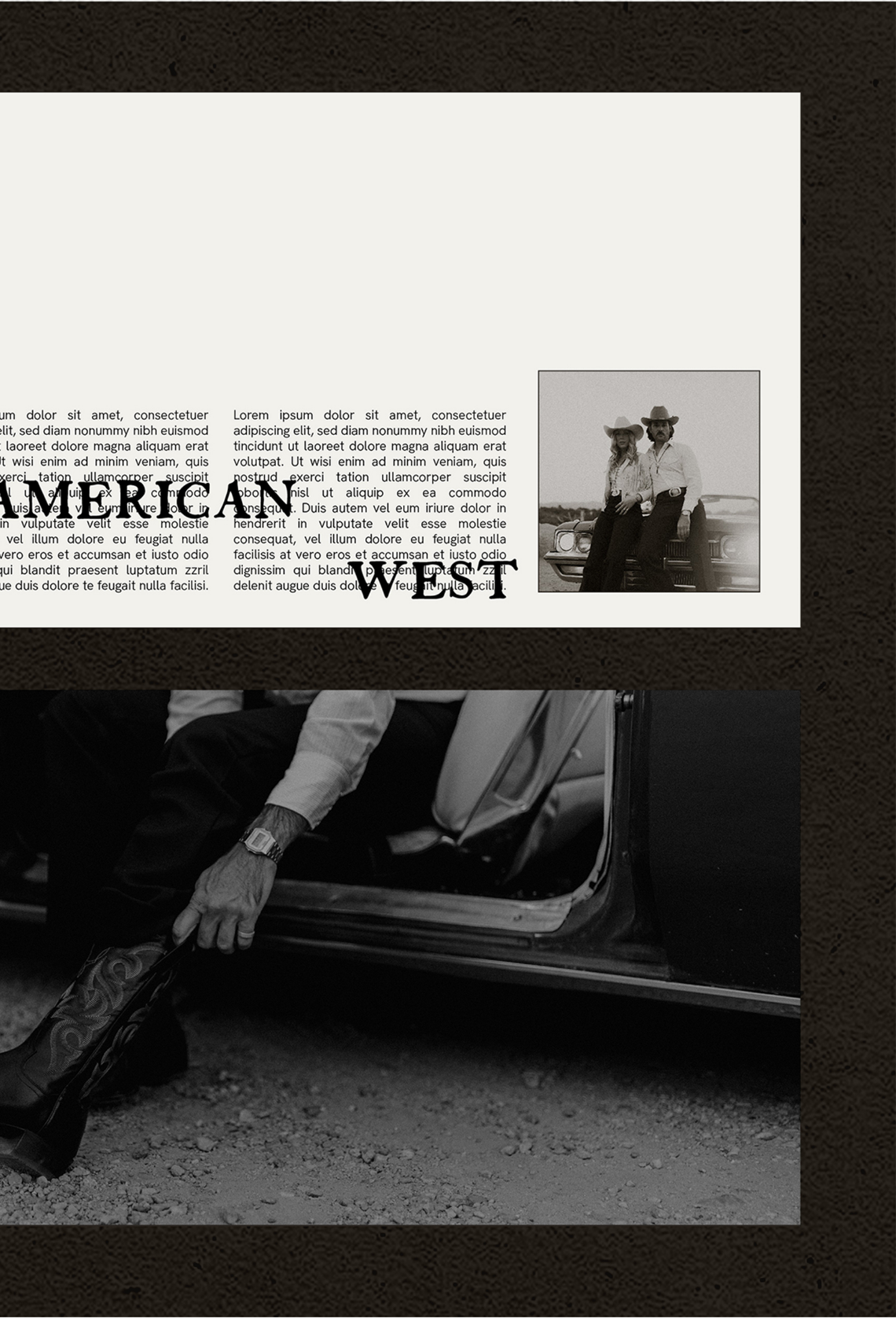
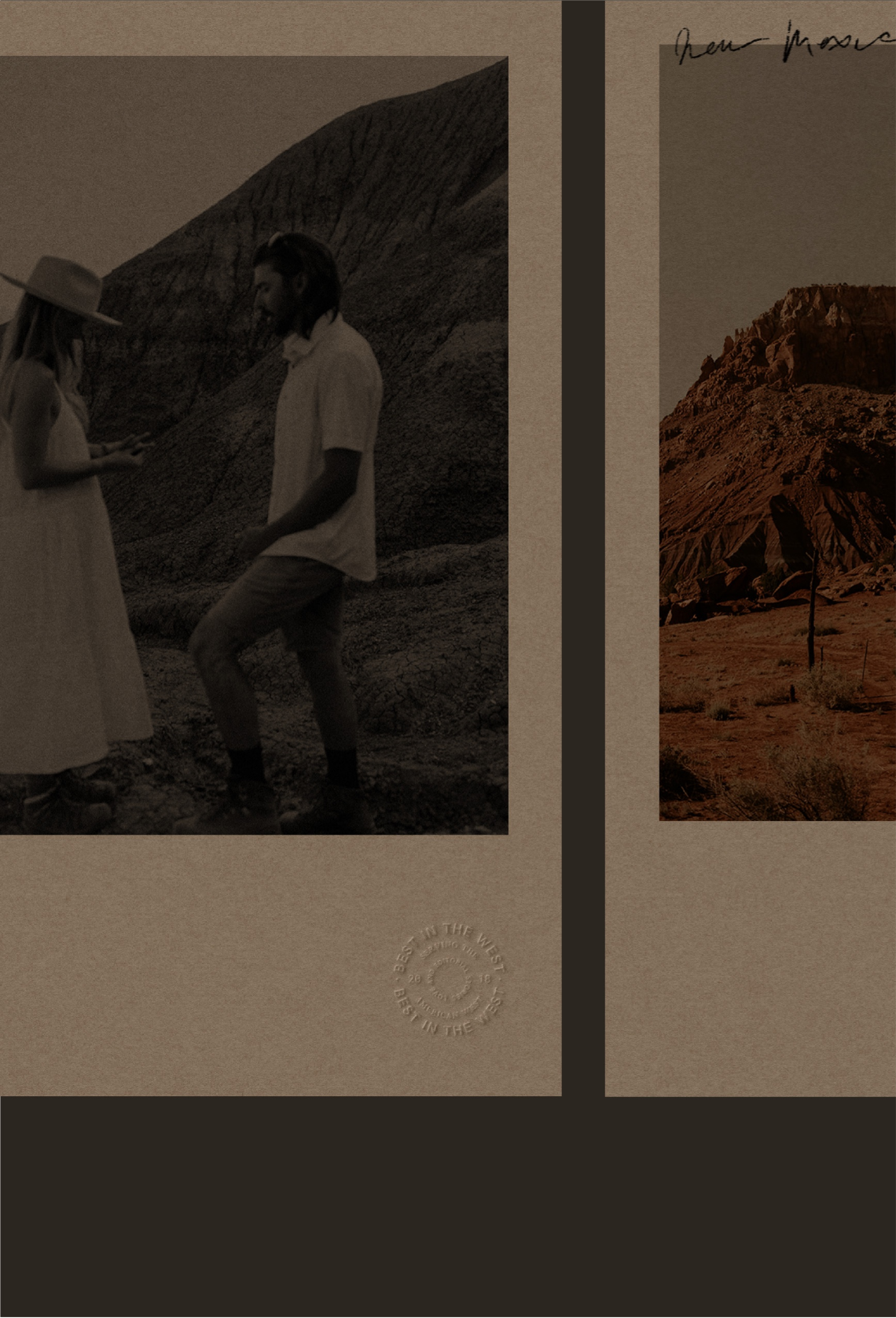
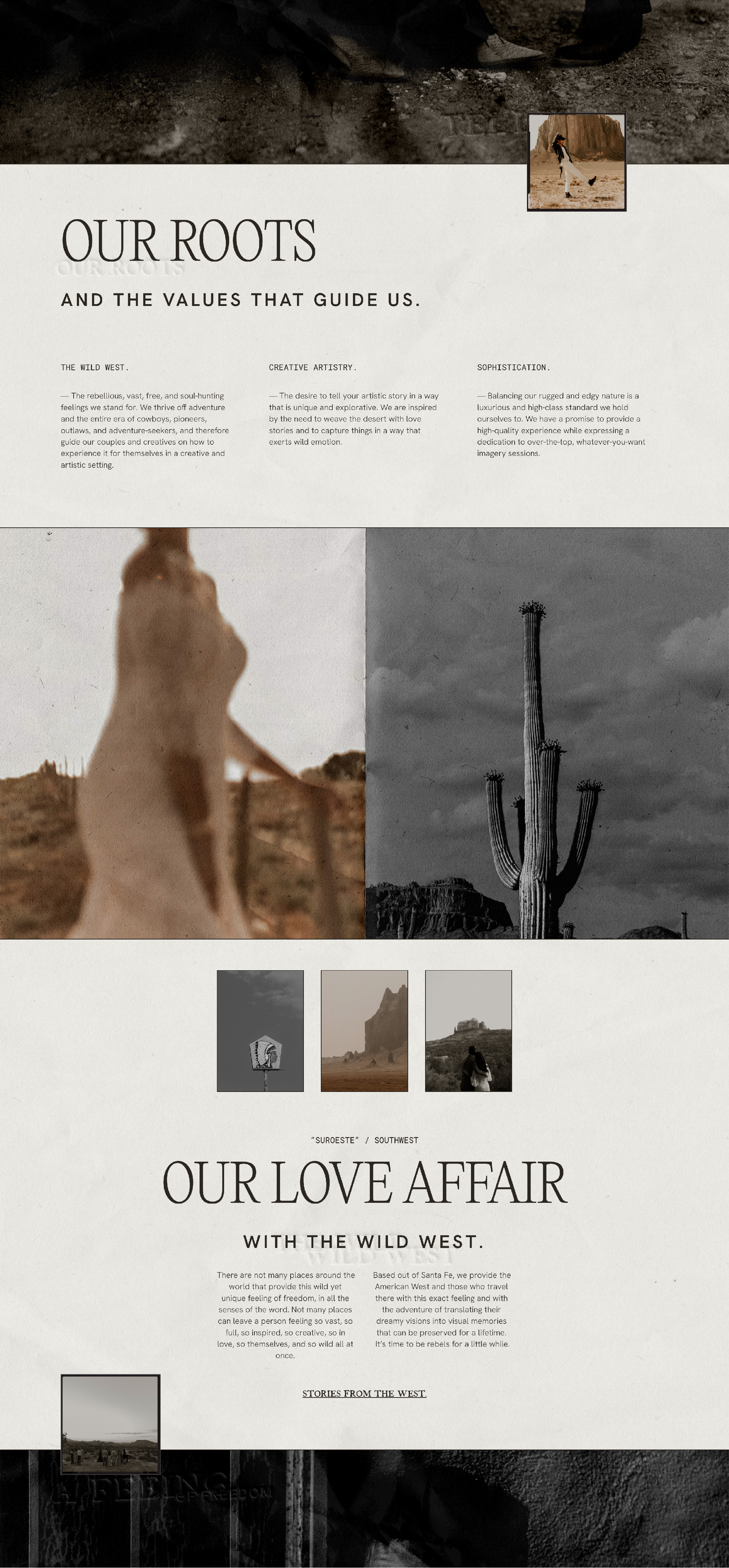
The brand story focuses entirely on that high quality southwestern experience all executed through sophisticated and vintage inspired typography, a cool and editorial layout, image heavy composition, rugged and organic textures, and western, edgy accents. By representing the old west through typography, composition, and feeling, we can bring the audience to a state of mind both organically and artistically.
LOVE NOTE
“Obsessed is truly an understatement! Truly the most perfect foundation EVER!
Thanks, Kaitlin for being part of this journey with us! You had such a huge influence and we couldn't have done it without you. You're truly the best thing to happen to my brand.”


FOOTNOTES
Behind The Design
The use of sophisticated yet vintage typography with editorial and western accents is the main focus of the brand identity — used to embody both the southwestern edge and sensual vibes Suroeste contains. The brand’s dream clients are ready to invest in a photographer that they believe will give them the full- body southwestern experience they’re looking for. They are creative, intentional, adventurous, rugged, grounded, and wildly passionate. To fully align with and attract these dream souls, Suroeste captures those feelings into its branding.


FOOTNOTES
Inspired By
film cameras, vintage fringe denim jackets, gas station newspapers, rebels in the desert, love notes on vintage postcards, over the top floral installations, long sandy roads, black cowboy boots, neutral interior magazines, tequila labels